Diorissima and the Art of Composition at Dior Joaillerie

At Dior, high jewellery rarely begins with a gemstone. It begins with a story.
Since 1999, Victoire de Castellane has built her language at Dior Joaillerie by reworking the house's founding preoccupations: flowers, colour, decorative excess and a certain Parisian fantasy filtered through Christian Dior's own fascination with gardens and art. Over time those references have become less literal and more elastic, shifting from floral compositions into hybrid, painterly constructions where gemstones behave less like hierarchies of value and more like fragments of image.
Diorissima, her latest haute joaillerie collection, sits firmly within that evolution. Structured around three environments loosely inspired by Venice and the natural world, it moves from cultivated abundance to aquatic depth and finally to a more abstract celestial register. The narrative is legible, but never rigidly illustrative — it functions as a framework for colour and composition rather than literal storytelling.

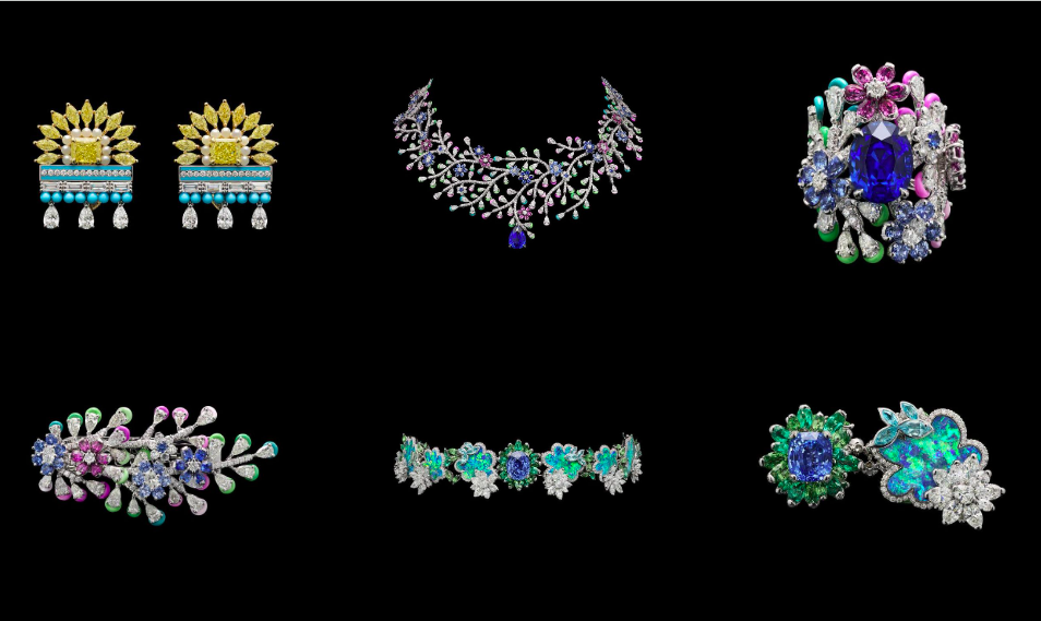
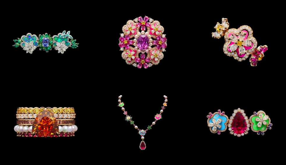
The first group is rooted in vegetation: clover, wisteria, fruiting branches. Familiar Dior territory, yet handled with a looseness that avoids botanical precision. Stones are set in clusters that suggest growth rather than depict it, assembled rather than drawn from nature.
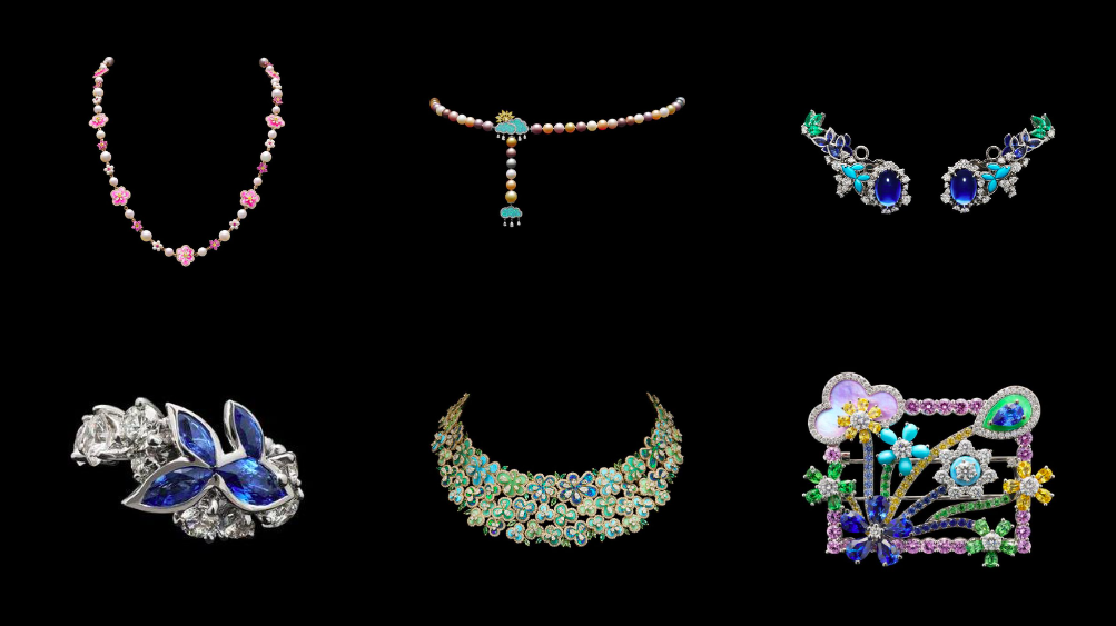
The second shifts underwater. Coral structures, fish and sea flora appear in cooler tonalities where blues and greens dominate and transparency becomes as important as colour. T
The final section moves away from recognisable terrain into a more open field of celestial references — suns, eclipses, rounded cloud forms. The motifs are treated as shapes rather than symbols, allowing light and colour to take precedence over iconography.
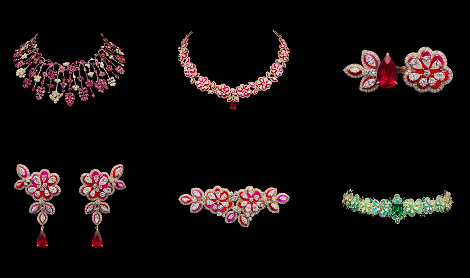
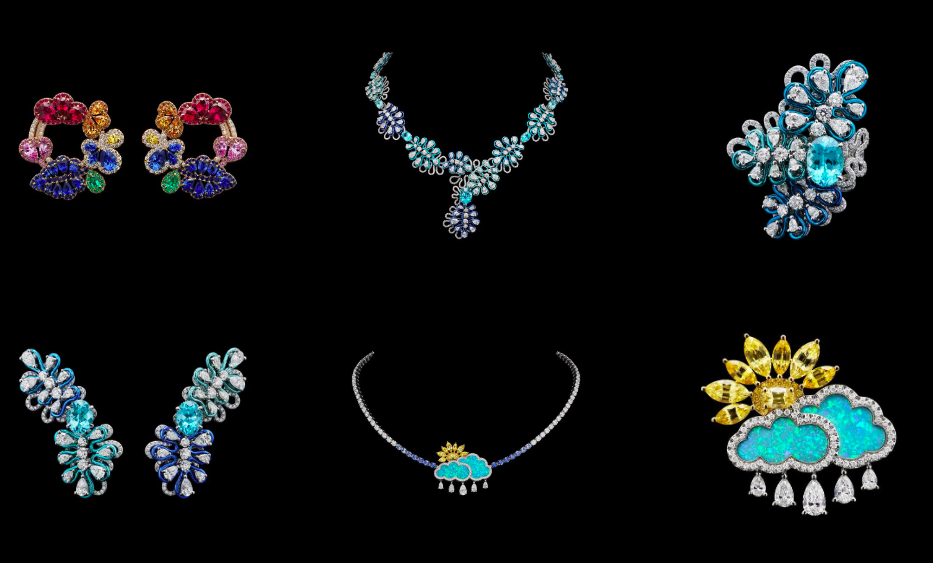

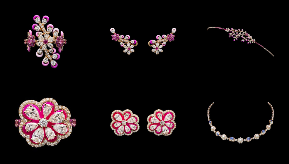
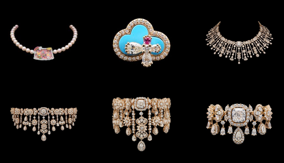
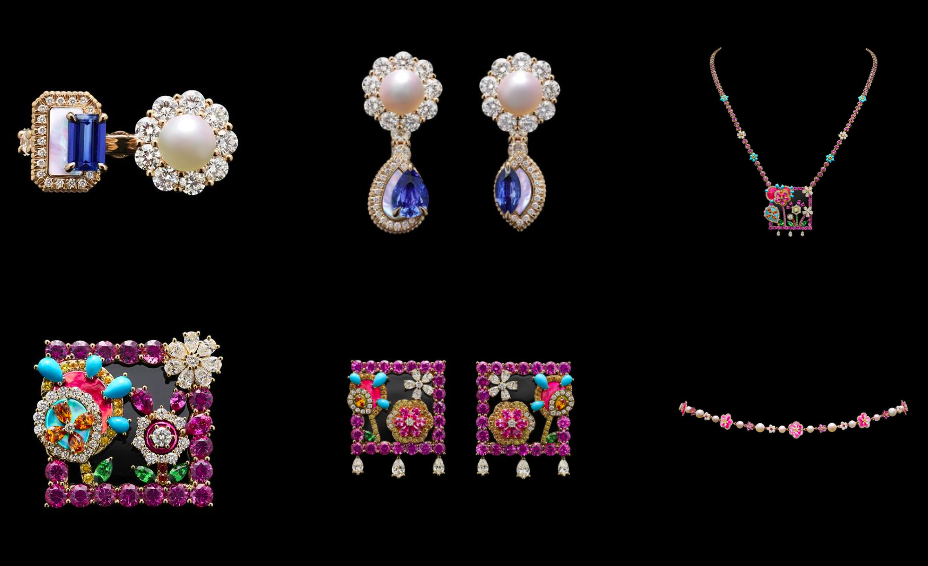
Throughout the collection, De Castellane continues to work through juxtaposition: unexpected colour pairings, irregular symmetry, compositions that resemble collage more than classical jewellery structure.
Technique reinforces that approach. Doublets — created by layering one stone over another — produce subtle shifts in colour that a single gem alone cannot achieve. Opal layered over chrysoprase, for example, creates unusual depth and changing tones. Lacquer, meanwhile, adds contrast through alternating matte and glossy surfaces, enhancing colour while giving the pieces greater visual texture.
While the collection introduces no new vocabulary, it recombines familiar ones with greater freedom.